In today’s world of global communication and social media, having a powerful logo is more important than ever. For organisations and entities that are devoted to advancing human rights, it is a way to spread awareness, represent the brand, and make a statement. Designing a human rights logo is a personal and meaningful task. It requires creativity and thoughtfulness, as you must find a way to accurately and effectively communicate an impactful message in a single image.
In this article, I would like to share with you seven things to consider beyond technical design theories, when creating a human rights logo.
#1 Colour – culture and symbolism
When selecting a color it is important to take into account the cultural context, symbolism, and personal preferences that are associated with it. Think about your corporate identity and values and who you are trying to reach. Do you have any specific fields or ethnic groups that your logo is aiming to reach? If you are creating a logo for an international audience, be mindful of how colors may be interpreted differently in particular cultures. If you feel unsure, seek out local people’s opinions or designers. Careful consideration and a mindful approach will help ensure that you pick appropriate and powerful colours for your human rights logo.
#2 Colour – Accessibility
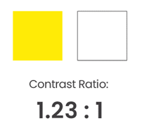
When designing a human rights logo you can help persons with colour vision deficiency or visual impairment by choosing the right colour combination. Consider using colours that have high contrast, such as black and white which has the highest possible contrast ratio of 21:1, or colours that are opposite one another on the colour wheel. This will make your design more accessible and easier to navigate for those with limited vision.
 |
 |
 |
Adobe’s Color Contrast Analyzer makes it easy to check your contrast ratios and see how people with color vision deficiency view your hues and shades. With this tool, you’ll get detailed information about potential color conflicts so you can make sure your designs are more accessible. You can design more inclusive online spaces and logos by following the Web Content Accessibility Guidelines (WCAG). These guidelines provide comprehensive information on how to create accessible designs.
#3 Use shapes and symbols to support your message
The basic building blocks of any design are shapes. Context, colour and positioning of these shapes can make a huge impact on how we perceive them. Pointy edges and lines often give off a sharp, stingy vibe, whereas round shapes appear softer and less hazardous. The same triangle can appear unstable and warning, pointing downwards, or solid and firmly grounded, pointing upwards. A square is a very balanced shape, but it is less dynamic and can feel a bit boring.
If your organisation’s focus is activism and challenges of human rights, dynamic shapes with strong, saturated colors and powerful symbols, could be a great choice. If you are working in the field of reconciliation and healing or trauma, a more calming look with gentle colors and balanced shapes could be the way to go. It is essential to take the time to explore the social and cultural meanings behind the shapes and symbols you use and the context you are using them.
#4 Use design to create associations and contrast
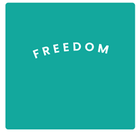
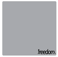
We all have our own unique perspectives when it comes to interpreting the things we see. Those perspectives are based on our individual experiences, feelings, or backgrounds. You can craft a design that evokes particular associations. Consider the connotations of the words or images you use. Additionally, the use of space, positioning, colour, and shape can reinforce your visual message. The following example uses the same word and typeface but by applying different design choices, the associations are very contrasting and evoke distinct emotions.
 The bold font of the word “freedom” gives it an airy, breathy feel, while the arch shape of the letters adds a sense of strength. Its top position in the teal square with plenty of room around it provides visual support for the concept, and the peaceful yet lively hue of the background radiates positive energy. The bold font of the word “freedom” gives it an airy, breathy feel, while the arch shape of the letters adds a sense of strength. Its top position in the teal square with plenty of room around it provides visual support for the concept, and the peaceful yet lively hue of the background radiates positive energy. |
 The cramped typeface with little spacing between the letters gives the word a tight, uncomfortable feel. The distortion creates an uneasy sensation and a sense of being pushed. Placed too close to the bottom edge of the grey square, it appears to be unsure of its position or crammed into the corner. Muted colors give a dismal feel. The cramped typeface with little spacing between the letters gives the word a tight, uncomfortable feel. The distortion creates an uneasy sensation and a sense of being pushed. Placed too close to the bottom edge of the grey square, it appears to be unsure of its position or crammed into the corner. Muted colors give a dismal feel. |
Contrast is great for helping the viewer focus on what is most important. Think of it beyond just colour—you can create contrast with opposites, for example, big vs. small, bold vs. thin, narrow vs. wide, serif vs. sans-serif or traditional vs. modern.
#5 Choose a typeface that supports your message
In today’s world the amount of available typeface choices can be overwhelming. In order to make an appropriate selection be mindful of shapes, contrast, and context. Think about what you want to say with your typeface. You can make your search easier by using filter functions on online font sources, which allow you to narrow down your choices by selecting tags such as geometric, playful, or friendly.
Think of accessibility, it should be easy to read and understand, while still being visually appealing. I highly recommend looking for a typeface with high-quality characters and a range of fonts, such as thin, italic, regular, semi-bold, and bold. Make sure that the typeface you use is licensed for your project or check out if you can support the designer in case the typeface is free.
#6 Tell your story
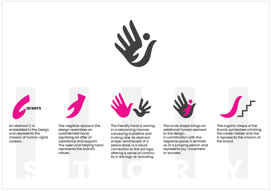
Storytelling can be used to convey a certain message, as well as evoke emotions from viewers. By weaving a narrative into your design, viewers will be able to connect with the logo on a more personal level. This connection ensures that the logo is more than just a symbol. It becomes a representation of the mission and the values of the brand. To ensure that the message is clear, determine what story you want to tell. What is your logo for? Put it in your specific context and use the above mentioned tips on colour, shapes and symbols, associations and typeface to help you crafting a visual story.
#7 Get feedback
Seeking feedback on your design can be daunting, as your logo is the result of hard work, dedication and passion. The response you receive may not be the one you anticipated and it can feel disappointing. However, see it as a learning experience. Constructive feedback is a great opportunity to change your own perspective and it can trigger fresh ideas. You gain valuable insight into how the logo is perceived and how it can be improved. You also learn a lot about yourself.
You can approach experts in the field of human rights and people who are not familiar with the topic. I would suggest asking friends and family first. Make clear what kind of feedback you are looking for. This could include questions like, “What is the logo telling you? Does the logo tell you what it is? What could be done to make the logo stand out more?”
I hope the seven tips will assist you on your human rights logo design journey and make it easier for you to start the exciting process.
Sabine Mann is the creator of the Human Rights Careers logo. She has worked as Programme Coordinator for the Vienna Master of Arts in Human Rights at the University of Vienna for nine years, where she developed essential skills and sensitivity in dealing with human rights topics. This valuable experience has had a profound impact on Sabine’s work as a designer. If you want to learn more about Sabine’s work, visit her website.


